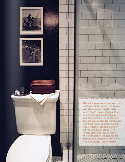
It seems, to me at least, that each new issue of Lonny is even better than the last. I thought they did a phenomenal job of featuring various styles and aesthetics in the new summer issue, which debuted yesterday. I was instantly smitten by several of the homes that were showcased, and immediately knew that I wanted to feature one of the rooms in today’s Fabulous Room Friday post. I kept vacillating between a room in one of the ultra-feminine homes featured in the magazine and the tailored and masculine look of the West Village home of Ethan Feirstein and Ari Heckman. In the end, deciding on a space came down to my mood.
{For me, the classic fixtures and high-gloss black walls evoke a very vintage, English mood.}
Feirstein and Heckman’s bold, moody bathroom appeals to me on so many levels. First of all, I love the idea of painting a small space, a dark, glossy color for impact. Then, they added that gorgeous green garden stool, vintage black and white photographs, pops of orange, classic tile choices, Greek Key towels and I was done for! The space features a plethora of my own favorite elements and it just feels so chic, sophisticated, and grown-up.
{The classic subway and hexagonal tile looks fantastic with the contrast of the dark walls.}
By now, sweet readers, you probably know that when it comes to interiors, I tend to veer towards tailored, more masculine looks. However, I know that finding a balance is key and I always add a touch of glamour. So, do tell, is this bathroom a little too masculine for your taste or do you think it’s just right? Is your design style more masculine or feminine?
Image Credit: Patrick Cline for Lonny


No comments:
Post a Comment