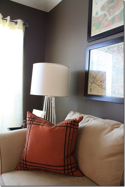
{This nook in our formal living room features a vintage Bruer chair, Circa Lighting Pimlico Tripod Lamp, Mark Rothko prints in gilded frames, and a convex mirror.)
I often get comments and e-mails from readers asking me to share my own home. For the longest time, I have felt a little evasive about doing so. After all, I am not a designer and felt that there was no way my home could stack up against the gorgeous spaces I post on a regular basis here on La Dolce Vita. After a little introspection, I realized that no one would be holding me up against such a standard. I thought about how much I love getting peeks into other people’s homes and here we are. Overall, I think my home is a good example of how to do a lot on a budget and how to make the most of what you have.
Over the last week, Fabian and I painted our formal living and dining rooms a lovely shade of mocha and changed a few accessories out. Normally, we are Benjamin Moore people, but we tried the new premium Behr paint (in Aging Barrel) from Home Depot and were so impressed with the coverage. The room was a wreck all week while we finished painting and it literally came together about an hour before we had our parents over for dinner to celebrate Tate’s first birthday.
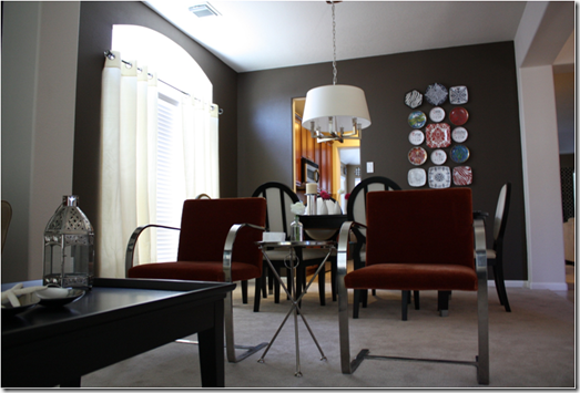
{Looking from the Dining Room into the Living Room}
I have the Square Tube Chandelier from Circa Lighting over my dining table which I had just started to set for Tate’s birthday dinner when I took these pictures.
I adore these vintage Knoll Brno chairs! We had considered reupholstering them in a cognac leather, but have decided to keep the burnt orange velvet upholstery. At least for now. I am always changing my mind. The fabulous, little aluminum side table is from my favorite place, Tarjay! I scored this little gem for $40 at Target after getting a tip from my friend, Hallie.


This spot has seen several lamps come and go in the four years we’ve lived in our home. I guess that is one of the perks of having a husband who works for one of the best lighting manufacturers in the world. This Carousel Lamp designed by Barbara Barry for Circa Lighting has been here for the last year or so and I still really like it.
The walls used to be more of a tan color and I had garnet-colored dupioni silk drapes. I love the new combination of mocha walls and ivory silk drapes so much more! If you were to keep walking past the dining room, my kitchen and breakfast room would be on your left and the family room would be on your right. Sooner than later, we will change out the carpeting for dark hardwoods.
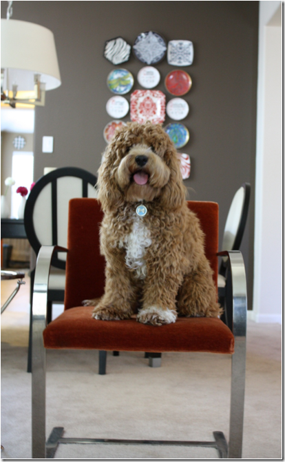
{The Sweet Birthday Boy}
I can’t resist taking pictures of my little Tater Tot! He is a great little model and I can’t believe he is already a year old! I hope you’ve enjoyed the peek into my humble abode.


No comments:
Post a Comment